Page 1 of 1
AFAP's Custom Character Sheets
Posted: Sun Oct 16, 2016 4:56 pm
by angelfromanotherpin
I'm doing more, will add them here for comment and criticism as they're completed.
First Attempt
Second Attempt
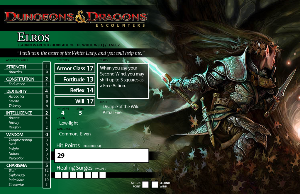
This one prioritizes practicality over prettiness, and the art (which is kind of muddy to begin with) gets a bit lost under the text boxes. So I used the free space on the back (from having no spells) to showcase the unobstructed art.
Posted: Sun Oct 16, 2016 6:32 pm
by Maj
These are awesome! The biggest recommendation I have for you is to consider an alternative font for the text boxes because the pretty fonts are hard to read. When I made mine, I paired fonts (sometimes I had three) so that I could have the headings and such in the awesome one, but the text blocks in something easier on the eyes.
Posted: Mon Oct 17, 2016 3:54 am
by angelfromanotherpin
Third Attempt
Mostly just a tinkered-with version of Second Attempt.
Posted: Mon Oct 17, 2016 8:33 pm
by Voss
All but the first one seem to be missing level.
Personally, I also think they're missing space for all the modifiers that are going into the totals for skills, saves and other derived stats. Being able to tell at a glance what is going into the final bonus saves a lot from mistakes and 'mistakes.' Also, having the final numbers rather than a blank spot to be filled in seems a poor choice.
Also, not having the rest of the skills with a value to use untrained is a pain, especially important things like perception or stealth.
As far as usable character sheets go, the art is mostly just an ink waster, and kills the practicality considerably.
Otherwise, the layout for the second one seems the most practical- the first seems laid out for space considerations rather than reference, and the number cascade on the third isn't particularly user friendly.
What are these for? They're obviously mostly D&D, but prowess is unfamiliar and a lot of the descriptions of abilities and spells don't match any edition.
Posted: Mon Oct 17, 2016 9:18 pm
by angelfromanotherpin
Voss wrote:All but the first one seem to be missing level.
Yeah, I took it off the header because I thought it looked bad. I guess I could have added another box for it somewhere, but IME players never forget what level they are. You'd need a new sheet every level anyway.
Personally, I also think they're missing space for all the modifiers that are going into the totals for skills, saves and other derived stats. Being able to tell at a glance what is going into the final bonus saves a lot from mistakes and 'mistakes.' Also, having the final numbers rather than a blank spot to be filled in seems a poor choice.
It's a compromise for purposes of space. Making the skill block wider is very problematic. The number has all the static mods in it, and the blank space is for situational things like ACP or buffs. Even the most thorough sheets I've ever seen don't have enough spaces for all the potential different crap that goes into skills and such.
Also, not having the rest of the skills with a value to use untrained is a pain, especially important things like perception or stealth.
Untrained perception is mostly just a Wisdom check, and that modifier is on the sheet. I guess stealth is a better point, I should find a spot for ACP.
Otherwise, the layout for the second one seems the most practical- the first seems laid out for space considerations rather than reference, and the number cascade on the third isn't particularly user friendly.
What do you mean by 'number cascade?' It's almost exactly the second sheet, somewhat rearranged to accomodate a longer skill list.
What are these for? They're obviously mostly D&D, but prowess is unfamiliar and a lot of the descriptions of abilities and spells don't match any edition.
Prowess is renamed BAB, just like Defense is renamed AC. They're Tomelike homebrew from a game I ran a whiles back.
Posted: Mon Oct 17, 2016 11:25 pm
by Voss
I mean a cascade. On the other sheets the numbers are grouped together, on that one they fall down across the horizontal spread of the page.
Stats are up in the corner, other numbers are lower down in the middle, then skills are further down still at the other edge.
And the numbers are interrupted by languages for no reason, which is also jarring.
It's a compromise for purposes of space. Making the skill block wider is very problematic. The number has all the static mods in it, and the blank space is for situational things like ACP or buffs. Even the most thorough sheets I've ever seen don't have enough spaces for all the potential different crap that goes into skills and such.
Really, you've never seen that? The baseline ones (in the actual book) for every edition (and most spinoff editions like arcana evolved) do, usually with 2-3 unnamed misc modifiers in addition to the standard ranks, stats, race, and trained.
Yours actually have the lowest information density I've ever seen on a character sheet, outside a pre-gen card in a module... which isn't really the same thing.
I'm also puzzled by the idea of redoing the character sheet every level. It seems to be missing the point, as well as the point of blank spaces and erasers.
Posted: Tue Oct 18, 2016 12:27 am
by angelfromanotherpin
Voss wrote:Really, you've never seen that? The baseline ones (in the actual book) for every edition (and most spinoff editions like arcana evolved) do, usually with 2-3 unnamed misc modifiers in addition to the standard ranks, stats, race, and trained.
I have no earthly idea what you're talking about. The
actual one in the 3.5 book has four spaces
total: total mod, ranks, stat, and
one misc slot. It's
the same on the Arcana Evolved sheet. The standard you're holding up appears to be wholly imaginary. If you can find one that has three
more spaces per skill that was published as a
baseline for
any edition, I will be shocked.
Yours actually have the lowest information density I've ever seen on a character sheet, outside a pre-gen card in a module... which isn't really the same thing.
I'm guessing you haven't looked at
that many custom sheets.
Posted: Tue Oct 18, 2016 3:57 pm
by angelfromanotherpin
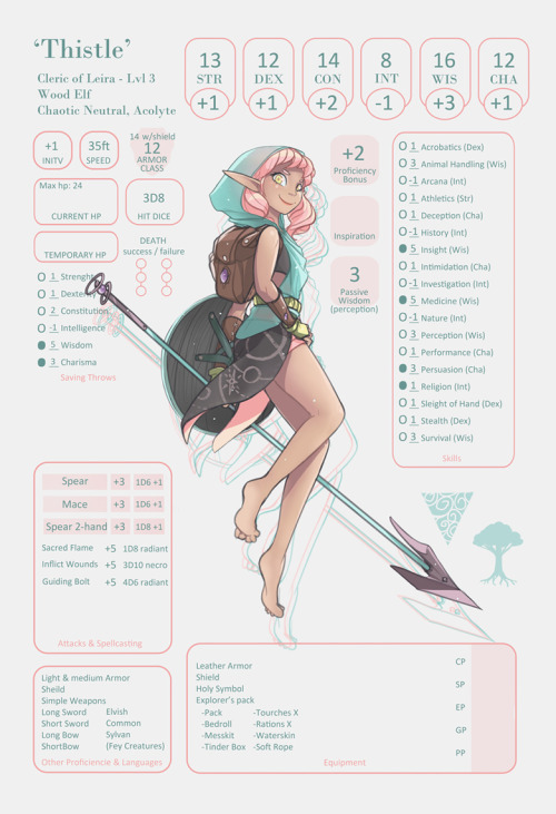
Someone asked for an elf wizard sheet for 5e, and because they are a dear friend whom I owe many favors, I swallowed my bile. Got to play with shapes and orientation a bit.
Bonus: The text running around the border is an actual poem in Sindarin/Tengwar.
edit: Back is now done.
Posted: Tue Oct 18, 2016 7:25 pm
by Mask_De_H
I like the layout of this most recent sheet the best: the mechanical information is easy to read, doesn't over crowd the art or get crowded out by the art, and the layout is generally more professional and "clean" looking.
Posted: Tue Oct 18, 2016 8:16 pm
by Chamomile
There's significantly less information on the sheet to begin with, mostly because there's a small, blank section for features and feats whereas other character sheets tend to have a plurality of their space dedicated to individually listed features. It also helps that 5e's skill section is a sane enough size that you can reasonably shove it alongside the stats like that and have it be fairly exhaustive (although there are not enough slots for all the INT, WIS, and CHA skills, and I don't think it's too implausible that an Elf Wizard might stack up on INT skills and end up with four or more).
If you want a good looking character sheet, step one is to play with a system that's conducive to it. That isn't necessarily the same thing as a system conducive to actually good play.

 Second Attempt


